Ok... so for those of you who follow my blog, you'll find that there is something unusual with the pics below. Remember when I first moved here I posted about my new apartment here. Well that place might look amazing and I know I said I loved it but in reality it was just wrong, for a number of reasons! So to cut a long story short, I moved out of there and finally found somewhere I am much happier. It's smaller which makes me feel more comfortable and doesn't have all the complex luxuries as the last one, but that doesn't bother me at all.
So here's the first sneak peek at my journey at decorating My First Little Rental Place!
Let's start with the living area.
Basically my apartment is a long rectangular shape so it's a little challenging to have the conventional living area layout. But that's ok, I think I've made the best of it.
To give you an idea, here's a really basic floorplan of the living area and furniture placement :

To the left of the floor plan is where it goes into the dining area and kitchen, which I'll post about a bit later. So you can see because of the width of the space and the placement of the TV plugs it was a challenge to place all my furniture.
Now with the move into one rental and out into another all within 4 months, I haven't bought anything new to dress it up with. It's all the pieces that I already have. With these basic snaps I've taken, I've matched it with some pieces I want to buy just to finish it off.
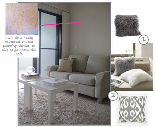
My 3 seater sofa just wouldn't fit anywhere else and I contemplated not even having it in this place but once I moved everything else in, there was plenty of room to put it on this wall... and I love it there. Being a really white space and white furniture I want to dress this up with colour! I know, hello did I say colour?? Yep and in addition to the yellow, I want to introduce pink and more grey! My mum, sister and friends would be extremely surprised at this choice as I usually hate have a dislike for pink... but I'm really feeling it at the moment - in small doses!! I'm going to paint a new canvas and the cushions, 1 and 2 I'm thinking about are from Table Tonic.

The TV bench which is never the prettiest spot in a living area, but I'm sorry I go against all interior designers - TV are a necessity and must be incorprated into the design.
So it's important to make it look as good as possible!
I just need to punch it up with some yellow accents.
1. Hive vase celery West Elm
2. Square Lacquer Tray yellow West Elm
This is what I've named the little TV nook!
For some bizarre reason, when these apartments where built they put the TV points on the long wall leaving this smaller wall (which would be perfect for a TV bench) for the place to put your sofa. I was so sure my two seater sofa wouldn't fit on this wall but once I got it in, voila it is a perfect fit.
I want to continue to build this as a really cosy nook to snuggle up and watch TV or blog! I want to bring in more texture and keep the colour to a minimum as the colourful sofa is just nearby.
You might also notice, to my disgust on the windows are vertical blinds, so not a fan!! They are cold and clinical but being a rental, I need to live with them. So that's also a contributing factor to make this side of the room really soft, textured and cosy.
1. Mongolian Lamb Pillow Covers West Elm
2. Grey Ikat Cushion Table Tonic
So naturally, I would love to hear any feedback you might have!
images via myfirstlittleplace


oh wow Sarah!! Good on you! Love what you're planning so far. I have the grey ikat cushions from TT in my bedroom and I love them. Have actually been thinking of putting some pink in too, feels like a great combo fro Spring-summer! Go for it! And was just about to comment on "no West Elm in aus" but I can just see the your previous post - yay! could be dangerous!!
ReplyDeleteRomana
Love the White on white with color look! It's so fresh and light feeling! You are totally right about apartments putting the tv plug on the long wall! Mine is the exact same way, I had to run my cord under a rug to switch everything over to the short wall! Can't wait to see what else you do!
ReplyDeleteI'm loving all the pillow choices for the couches. I think those paired with your colorful wall art will really start cozying it up.
ReplyDeleteDo you mind me asking what program you used to draw up the floorplan?
ReplyDeleteB
Hi B,
ReplyDeleteI didn't actually use any particular program, I just got a bit savvy with your normal pc programs :)
Thanks Sarah